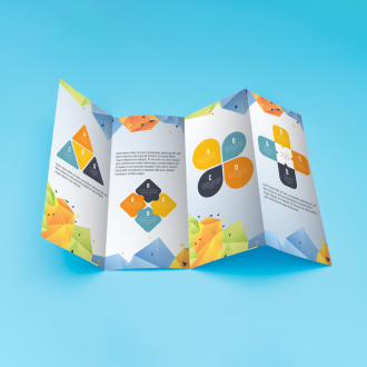
Business Card (16pt) Horizontal
- Product Code: B-C-14-PT-H
- Availability: In Stock
Available Options
- Shipping
- Factory Pickup
Blind Shipping From:
Off
Change
Shipping To:
16 pt. Cardstock: The Premier Choice for Professional Business Cards
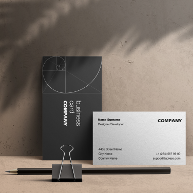
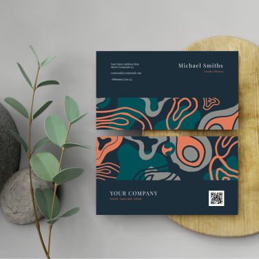
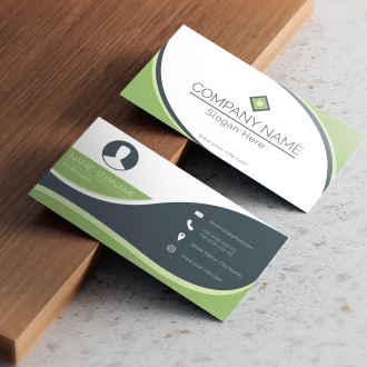
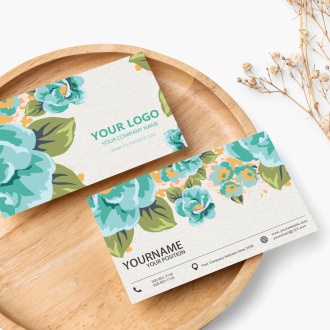
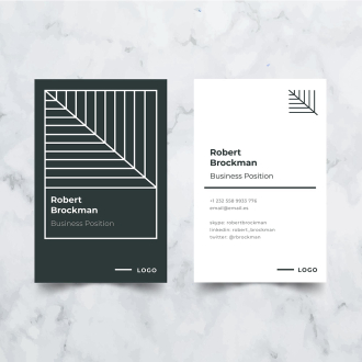
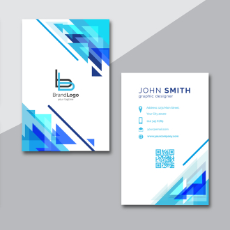
Showcase premium business card design with 16 pt. Cardstock. High-quality 16 pt. cardstock is the gold standard for business-card printing services, offering a perfect blend of robustness and sophistication. Its substantial thickness sets it apart from ordinary card materials, providing a firm feel that conveys professionalism and durability. Our custom business card solutions support templates or your own uploads design for unique branding.
This premium cardstock is notably resistant to bending and wear, ensuring your business cards maintain their pristine condition through handshakes and exchanges. The finely textured surface of 16 pt. cardstock is engineered for superior print quality, enabling the reproduction of vivid colors, crisp text, and clear graphics through our online ordering platform, which are essential for making a lasting impression.
Ideal for a wide range of professional settings, these business cards products strike an excellent balance between tactile quality and practicality. Experience dedicated customer service from proofing to delivery. Moreover, their impressive feel adds a tactile dimension to your brand's presentation, making them an essential tool for networking and promotion. In essence, In essence, 16 pt. cardstock business cards deliver aesthetic excellence, functional durability, and reinforced professionalism with precision full-color printing.
Product Features:
- - Crafted from premium 16 pt. cardstock for superior durability
- - Designed for professional use with a high resistance to bending and wear
- - Industry Standard size 2" x 3.5"
- - Business card printing service with high-definition printing at 1200 x 1200 dpi ensures sharp, vivid graphics and text
- - Double-sided printing for custom business card available to maximize information and design space
- - Optional UV coating for added protection and a luxurious feel
Best Practices:
- We cannot color match. Please see our Color Optimization Guide in order to get great results including true black and blue colors.
- Get the perfect cut. Please see our Die Cut Printing Guide for instructions on how to setup your design file. (Not applicable to every product or print, only products that need to be die-cut or contour cut.)
- Clear Message. Ensure that the message on the poster is concise, clear, and easy to understand at a glance. Use bold headlines, brief text, and impactful visuals to capture attention and communicate the key information effectively.
- Eye-Catching Design. Create a visually appealing design that grabs attention and stands out. Use vibrant colors, high-quality images, and attractive typography to make the poster visually engaging. Incorporate your branding elements to maintain consistency and reinforce brand identity.
- Proper Placement. Position your posters in high-traffic areas where your target audience is likely to see them. Consider factors such as foot traffic flow, visibility from different angles, and locations where people tend to spend time or pause, such as waiting areas or entrances. Ensure that the poster is at an appropriate eye level for easy viewing.
- Targeted Audience. Tailor the content and design of your poster to resonate with your specific target audience. Consider their demographics, interests, and preferences to create a message that appeals to them and sparks their interest.
- Call to Action. Include a clear and compelling call to action on the poster, guiding viewers on what they should do next. Whether it's visiting a website, making a purchase, attending an event, or contacting your business, make it easy for viewers to take the desired action by providing relevant contact information or directing them to a specific destination.
- Visual Hierarchy. Organize the elements on the poster in a logical and visually pleasing way. Use a hierarchy of information, with the most important details prominently displayed. Arrange the elements to guide viewers' attention smoothly and naturally from one section to another.
- Readability and Legibility. Ensure that the text on the poster is easily readable from a distance. Use a legible font and appropriate font size to ensure clarity. Avoid overcrowding the design with too much text, and provide ample white space to enhance readability.
- Brand Consistency. Maintain consistency with your brand's visual identity and messaging. Use consistent colors, fonts, and imagery that align with your brand guidelines. This helps to strengthen brand recognition and create a cohesive visual experience.
- Regular Maintenance. Regularly inspect and maintain your posters to ensure they remain in good condition. Replace worn-out or damaged posters promptly to maintain a professional and well-presented display.
- Measure and Adjust. Track the performance of your posters by monitoring response rates, customer feedback, or sales data. Use this feedback to make adjustments and improvements to your poster designs and strategies for future campaigns.


